Can we do better than this?
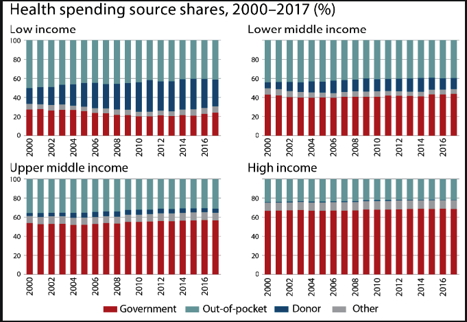
The World Health Organization (WHO), in coordination with the World Bank, maintains data on a variety of topics, including global health care expenditure. They’ve recorded data between 2000 and 2017 on how the world spends its money on healthcare. Here’s their actual data viz.

Figure 1: WHO visualization on global health spending between 2000 and 2017. Source: WHO
This hardly looks like an effective visualization by Cole Nussbaumer Knaflic’s standards in her book Storytelling with Data, so let’s see how we can improve this to better align with her advice on effective visualizations.
Background on the data
The World Bank classifies countries into income brackets, including Upper Middle Income, Middle Income, and Lower Middle Income. Regardless of country bracket classification, most countries record data on health care expenditures per capita by the government, private entities, and out-of-pocket personal expenses. The data provides a snapshot on how spending is divided among those three categories.
One of my SMU professors, William Bowser, kindly collected the raw data and you can download it below.
Download world_bank_WDIhealth.csv
This contains expenditures in U.S dollars rather than percent form, but that matters not since the content is the same. His aggregation excludes the High income category.
Recreating the viz
We’ll need to do some data cleaning as the format for data entry isn’t optimal for data analysis and visualization. The complete code for cleaning and plotting the data is provided below, but I won’t spend time discussing the cleaning portion as I think focusing on comparing the original WHO viz with mine is more interesting!
library(tidyr)
library(tidyverse)
library(plotly)

wb <- read.csv("~/Desktop/SMU/Viz/world_bank_WDIhealth.csv")

# eliminate redundant or empty columns
wb2 <- wb[, -c(3,23,24)]

# reformat yr columns
cols_to_change <- colnames(wb2)[4:21]
yr_cols <- sapply(cols_to_change, function(x) substring(x, 2, 5))
colnames(wb2)[4:21] <- yr_cols

# remove physician data from main data frame
physician_rows <- which(wb2$Series.Code == "SH.MED.PHYS.ZS")
physician_data <- wb2[physician_rows, ]

# delete physician data from original data frame
wb2 <- wb2[-physician_rows, ]
# make rest of data numeric instead of columns
wb2[, 4:21] <- apply(wb2[, 4:21], 2 , as.numeric)

# make from wide to long by gathering all years into a single variable
wb2_tidy <- wb2 %>% gather(Year, Value, "2000":"2017")

# convert expenditure types to shorter names
wb2_tidy <- wb2_tidy %>% mutate(`Expenditure Type` =
                      ifelse(Series.Code == "SH.XPD.PVTD.PC.CD", "Private",
                      ifelse(Series.Code == "SH.XPD.GHED.PC.CD", "Government", "Out-of-pocket")))

# hat tip of interaction from https://stackoverflow.com/questions/9968976/group-by-two-columns-in-ggplot2

ggplot(wb2_tidy, aes(Year, Value)) +
  geom_line(aes(color=Country.Name,
            group=interaction(Country.Name, `Expenditure Type`)), size = 1.5) +
  geom_point(aes(shape = `Expenditure Type`), size=2.5, color = "gray17") +
  annotate("rect", xmin = 9 - 0.5, xmax = 9 + 0.5, ymin = 122, ymax = 155, alpha=0.2)+
  annotate("rect", xmin = 12 - 0.5, xmax = 12 + 0.5, ymin = 95, ymax = 125, alpha = 0.2)+
  annotate("segment", x = 7, xend = 9, y = 200, yend = 155, arrow = arrow(angle = 20))+
  annotate("segment", x = 7, xend = 12, y = 200, yend = 120, arrow = arrow(angle = 20))+
  annotate("text", x = 3.5, y = 215, label = "Middle income countries took 3 years\n longer than Upper income countries\n to see government spending outpace\n private spending", hjust = 0)+
  theme_minimal() +
  xlab("") +
  ylab("Per Capita Expenditure (US $)")+
  theme(text = element_text(size = 16),
        panel.grid.major.x = element_blank(),
        axis.text.x = element_text(angle = 45))+
  scale_color_brewer(palette = "Dark2") +
  labs(color = "Country Income Bracket", shape = "Expenditure Type") +
  ggtitle("Global Spending on Health, 2000 - 2017")
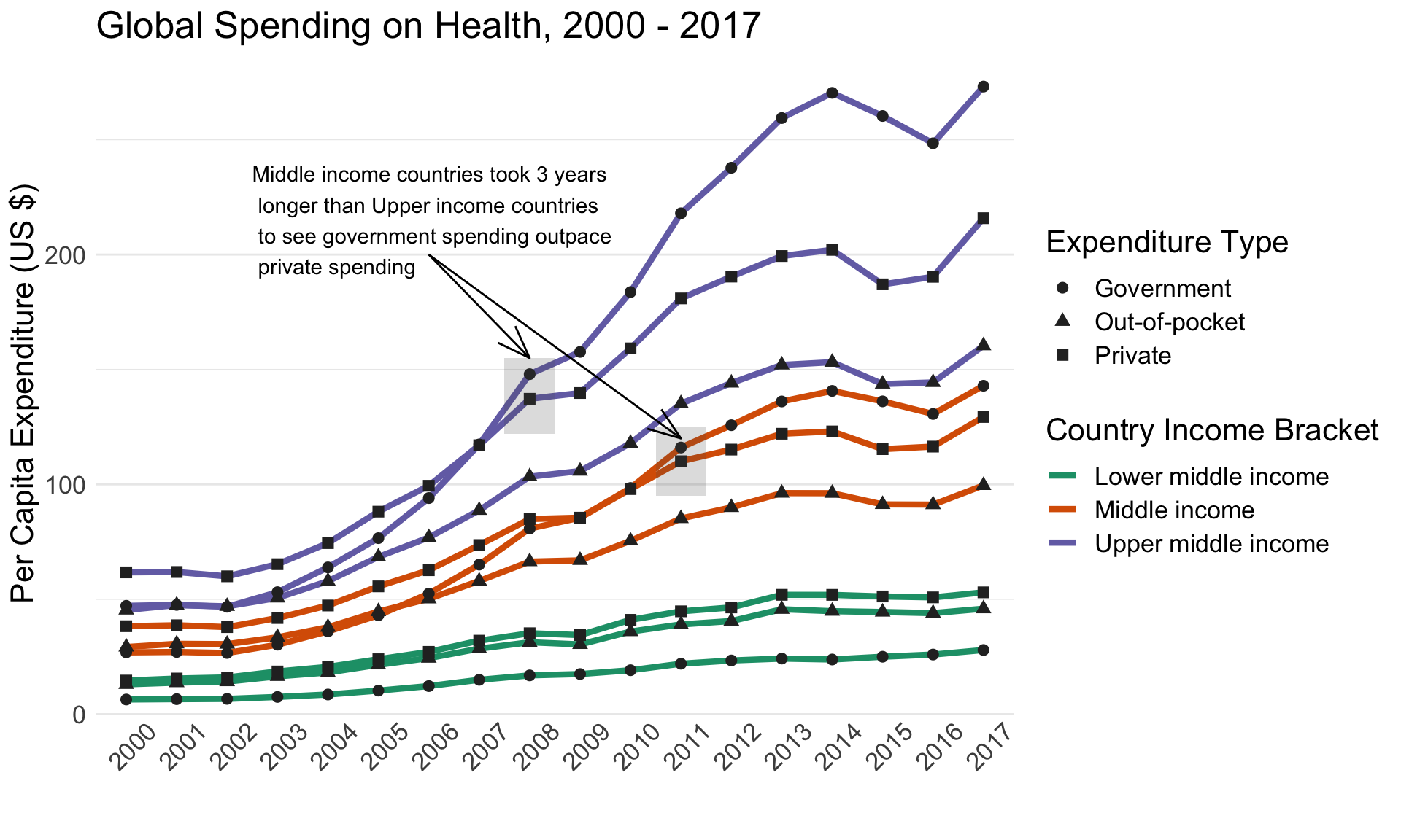
Figure 2: Revised WHO visualization. This immediately looks more descriptive.
This looks a bit more pleasing to look at, I hope you would agree! But equally (or more) important is the insights this revised viz uncovers. Here are my observations:
Middle income and Upper middle income countries closely resemble each other in the upward trajectory of per capita expenditures
It took about three years longer for Middle income countries to see government spending outpace private spending, compared with Upper middle income countries (2011 vs 2008; see the grey boxed regions for comparison)
Only Lower middle income countries see health expenditures dominated by private sector spending
Lower middle income is the only category of countries that feature consistently higher out-of-pocket spending on healthcare than government healthcare spending.
Wrapping Up
Data visualization done right can illuminate info that poor visualizations mask. Even professional organizations can fail to adhere to Knaflic’s standards of effective visualization. I hope this exercise encourages us to better consider how we approach data viz in the future. And if you already make great viz, kudos to you!