import pandas as pd
import seaborn as sns
import matplotlib.pyplot as plt
# using a relative path would probably be better!
bankingDF = pd.read_csv("/Users/roberthazell/Desktop/SMU/ML1/bank-additional-full.csv")
Business Understanding
The Bank Marketing Data Set from the UCI Machine Learning Repository was selected to be analyzed by our group. The data involves information obtained from direct telemarketing campaigns from a Portuguese banking institution. The data contains 41,188 observations with 20 attributes and was collected between May 2008 to November 2010.
Our objective is to build a customer conversion model that predicts the likelihood a customer converts after seeing a bank term deposit offer. A cash investment, which will be held at the bank, is invested at an agreed rate of interest over a fixed period of time. Characteristics of a customer such as age, education, type of job, and many others will be analyzed to determine if they are factors determining conversion.
A good prediction algorithm would establish a relationship or correlation between specific attributes with the probability of whether a bank customer would subscribe to a bank term deposit. We will assess the qualities of our models using a confusion matrix. With the results from our analysis, the attributes that are strongly correlated to a customer subscribing to a bank term deposit would be emphasized in future telemarketing campaigns.
Data Understanding
Data Dictionary
The description for the 20 data attributes are taken from: https://archive.ics.uci.edu/ml/datasets/bank+marketing, but the complete list of features have been witheld from the dataset.
| Attribute | Data Type | Description | Examples |
|---|---|---|---|
| age | numeric | The age of the customer in years | 26, 45, 50 |
| job | categorical | The type of job of the customer |
admin, blue-collar, entrepreneur, housemaid, management, retired, self-employed, services, student,technician, unemployed, unknown |
| marital | categorical | The marital status of the customer | divorced, married, single, unknown |
| education | categorical | The education level of the customer |
basic.4y, basic.6y, basic.9y, high.school, illiterate, professional.course, university.degree, unknown |
| default | categorical | If the customer has their credit in default | yes, no |
| housing | categorical | If the customer has a housing loan | yes, no |
| loan | categorical | If the customer has a personal loan | yes, no |
| contact | categorical | Customer contact communication type | cellular, telephone |
| month | categorical | Last contact month with the customer | jan, feb, mar, …, nov, dec |
| day_of_week | categorical |
Last contact day of the week with the customer (note that the bank is only open during weekdays) |
mon, tue, wed, thu, fri |
| duration | numeric | Duration of the last contact with customer in seconds | 20, 30, 60 |
| campaign | numeric |
The number of contacts performed during the campaign for the customer |
3, 7, 15 |
| pdays | numeric |
Number of days passed since the customer was last contacted (999 means customer was never contacted) |
20, 30, 999, etc. |
| previous | numeric | Number of contacts made with customer before this campaign | 20, 30, 1000, etc. |
| poutcome | categorical | Outcome of the previous marketing campaign | failure, nonexistent, success |
| emp.var.rate | numeric | Employment variation rate - quarterly indicator | -1.2, 1.1, 2.3 |
| cons.price.idx | numeric | Consumer price index - monthly indicator | 91.21, 93.33, 94.32 |
| cons.conf.idx | numeric | Consumer confidence index - monthly indicator | -50.8, -36.6, -26.9 |
| euribor3m | numeric |
Interest rate where a selection of European banks lend one another funds in euros where loans have a maturity of 3 months |
1.048, 4.857, 3.569 |
| nr.employed | numeric | Quarterly average of the total number of employed citizens | 4198, 5191, 5325 |
| y | categorical | Has the client subscribed to a term deposit? (the product) | yes, no |
Verifying Data Quality
The quality of the data initially appears relatively good as there are no missing or NA values. However, further reading into the documentation reveals several missing attribute values, all for categorical variables. These are encoded as “unknown”. We’ll need to decide on either treating these “unknown” values as a possible class label, delete or impute these values. The attributes that contain the “unknown” value are:
job(330 instances)marital(80 instances)education(1731 instances)default(8597 instances)housing(990 instances)loan(990 instances)
For now in our exploratory data analysis we’ll keep ‘unknown’ values as a class label, but will need to re-evaluate this value in future analysis.
There are 12 duplicate observations, which accounts for about 0.1% of the data. However, without an attribute to indicate if each observation is unique like ‘CustomerId’, it is very possible that the duplicate observations are legitmate observations that are unrelated to the other duplicates.
There are outliers in several attributes. For age the majority of the customers fall between the ages of 17 and 60, with 10 customers over the age of 90. The campaign attribute, which measures how often a customer is contacted, also has some extreme values where 8 customers were contacted over 40 times during a marketing campaign. Visualization of these and other features are presented a little later. Future analysis will need to be done with and without outliers to determine any possible improvement in model adequacy.
Simple Statistics
The table below displays the simple statistics for the numeric values of the data set.
We see the average bank customer is around 40 years old and contacted 2 to 3 times during the marketing campaign, but rarely contacted before the marketing campaign as deduced from the means of pdays and previous attributes, which measure the number of days after the customer was last contacted from a previous campaign and the number of times the customer was contacted before the current campaign respectively. As one would expect, the targeted customers are at an age where investing makes sense. Customers in the lower age range (late teens to early 30’s) are less likely to invest their money as they may not be planning for the future or may not have the disposable income to invest.
bankingDF.describe() age duration ... euribor3m nr.employed
count 41188.00000 41188.000000 ... 41188.000000 41188.000000
mean 40.02406 258.285010 ... 3.621291 5167.035911
std 10.42125 259.279249 ... 1.734447 72.251528
min 17.00000 0.000000 ... 0.634000 4963.600000
25% 32.00000 102.000000 ... 1.344000 5099.100000
50% 38.00000 180.000000 ... 4.857000 5191.000000
75% 47.00000 319.000000 ... 4.961000 5228.100000
max 98.00000 4918.000000 ... 5.045000 5228.100000
[8 rows x 10 columns]Strictly viewing the results of if a customer subscribed or not, the percentage of customers who did subscribe is a little over 11%.
# The percentage of individuals that subscribed to the bank
len(bankingDF[bankingDF.y=='yes'])/len(bankingDF)*100.011.265417111780131In the data set, over 60% of the customers are married as opposed to being single, divorced or a small percentage being unknown. This makes sense as married customers are most likely to invest for the future whether it being to purchase a home or to pay for their children’s college education.
# Marital status basic statistics
bankingDF.marital.describe()
count 41188
unique 4
top married
freq 24928
Name: marital, dtype: objectVisualize Attributes
Age of Potential Customers
# histogram of age
ax = sns.distplot(bankingDF["age"])
ax.grid(False)
plt.tick_params(labelsize=12)
plt.show()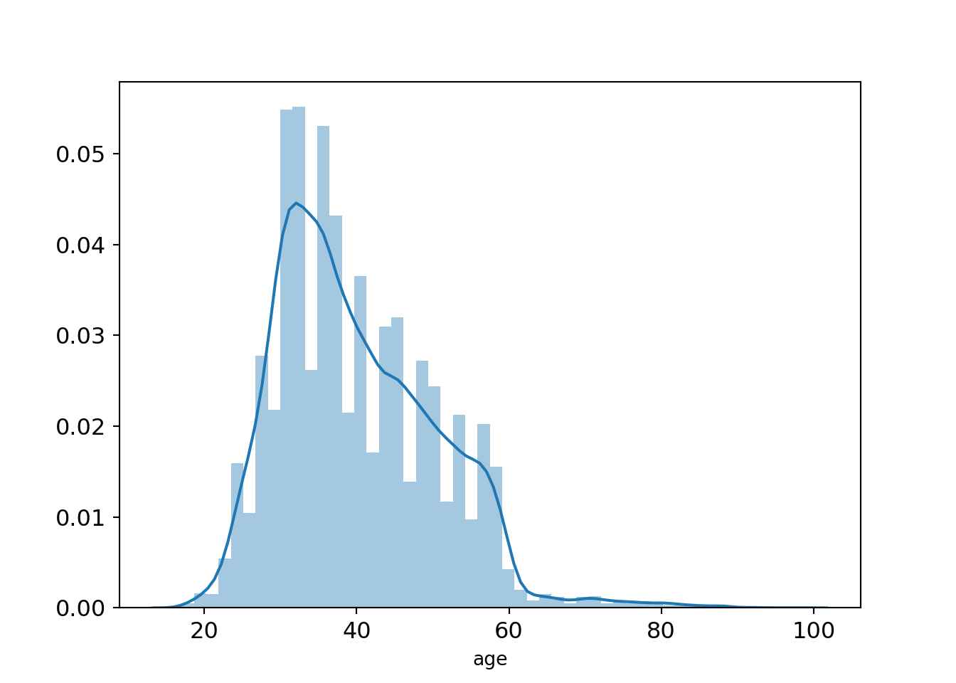
There is some right skew in terms of the age range the bank targets, with the majority of customers targeted in their 30s-40s. This makes sense as those in that age bracket would more likely have money to spend on long-term deposits given a stable income. Individuals past 60 years old are not considered, most likely since such are already retired; they should have made long-term deposits decades before!
Job Categories
fig, ax = plt.subplots(figsize=(20,10))
job_totals = bankingDF["job"].value_counts()
job_totals = pd.DataFrame({"Job Type": job_totals.index,
                         "Total": job_totals.values})

ax = sns.barplot(x = "Total", y="Job Type", data=job_totals,
                 palette="Blues_d")
ax.grid(False)
plt.tick_params(labelsize=20)
_=plt.xlabel("Total Prospects", fontsize = 22)
_=plt.ylabel("Job Type", fontsize = 22)
plt.show()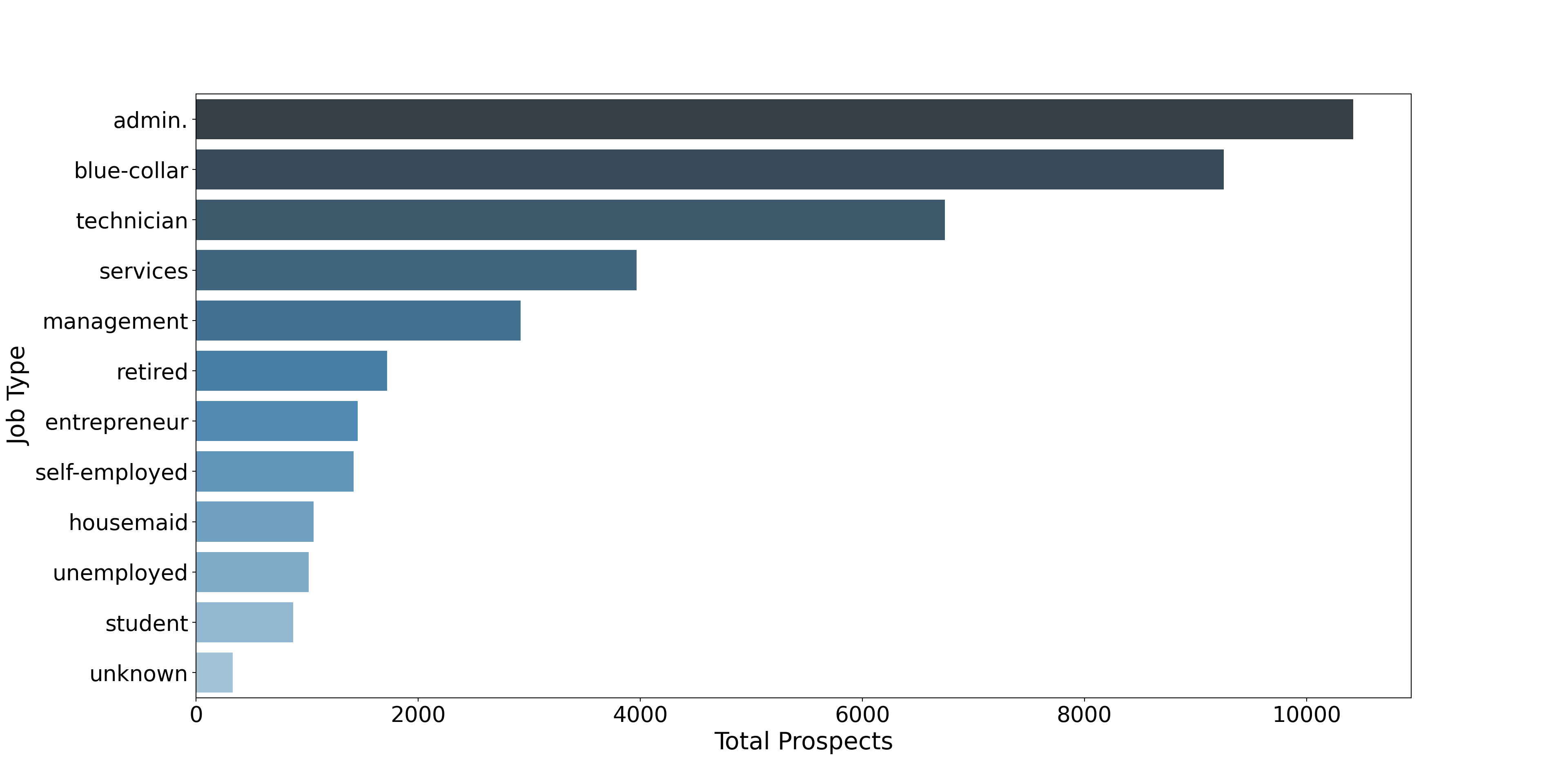
The bank tends to heavily profile blue-collar workers in that three of the top four job types are in the blue-collar sector. The number one category – admin – is white-collar.
How frequent a prospect is called (current campaign)
_=plt.boxplot(bankingDF["campaign"], vert=False)
_=plt.xlabel("Number of times contacted", fontsize=20)
plt.grid(False)
fig = plt.gcf()
a = plt.gca()
_=a.axes.get_yaxis().set_ticks([])
fig.set_size_inches(18.5, 8)
plt.tick_params(labelsize=18)
plt.show()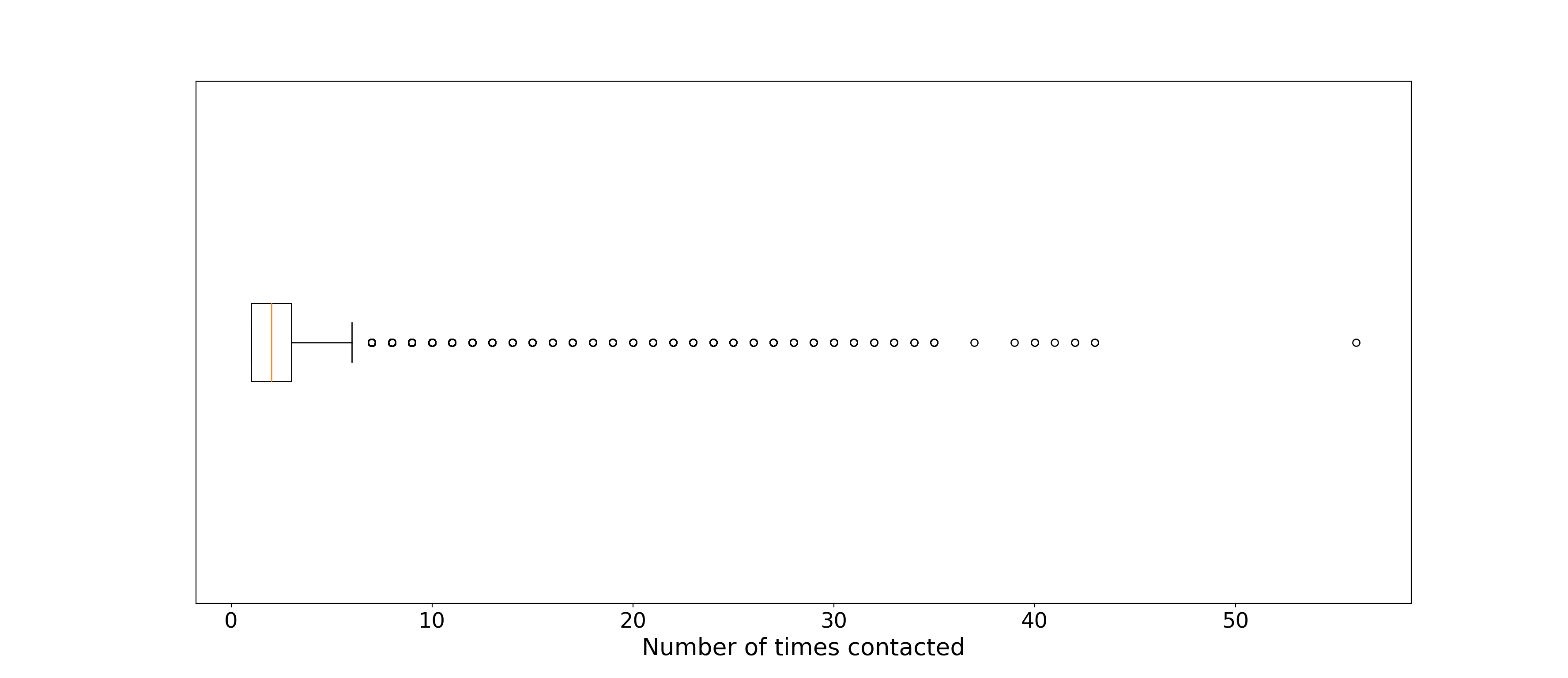
On average the bank has been in contact less than 5 times for any given customer, but several were constantly targeted. Perhaps these are highly promising but wavering customers.
When are calls made?
fig, ax = plt.subplots(figsize=(15,10))
# count number of calls by day
call_day = bankingDF["day_of_week"].value_counts()
# convert to dataframe
call_day = pd.DataFrame({"Day": call_day.index,
                         "Total": call_day.values})
# plot barplot of counts
ax = sns.barplot(call_day["Day"], call_day["Total"],
           palette="Purples_d")
ax.grid(False)
_=plt.xlabel('')
_=plt.ylabel("Calls Made", fontsize=20)
plt.tick_params(labelsize=18)
plt.show()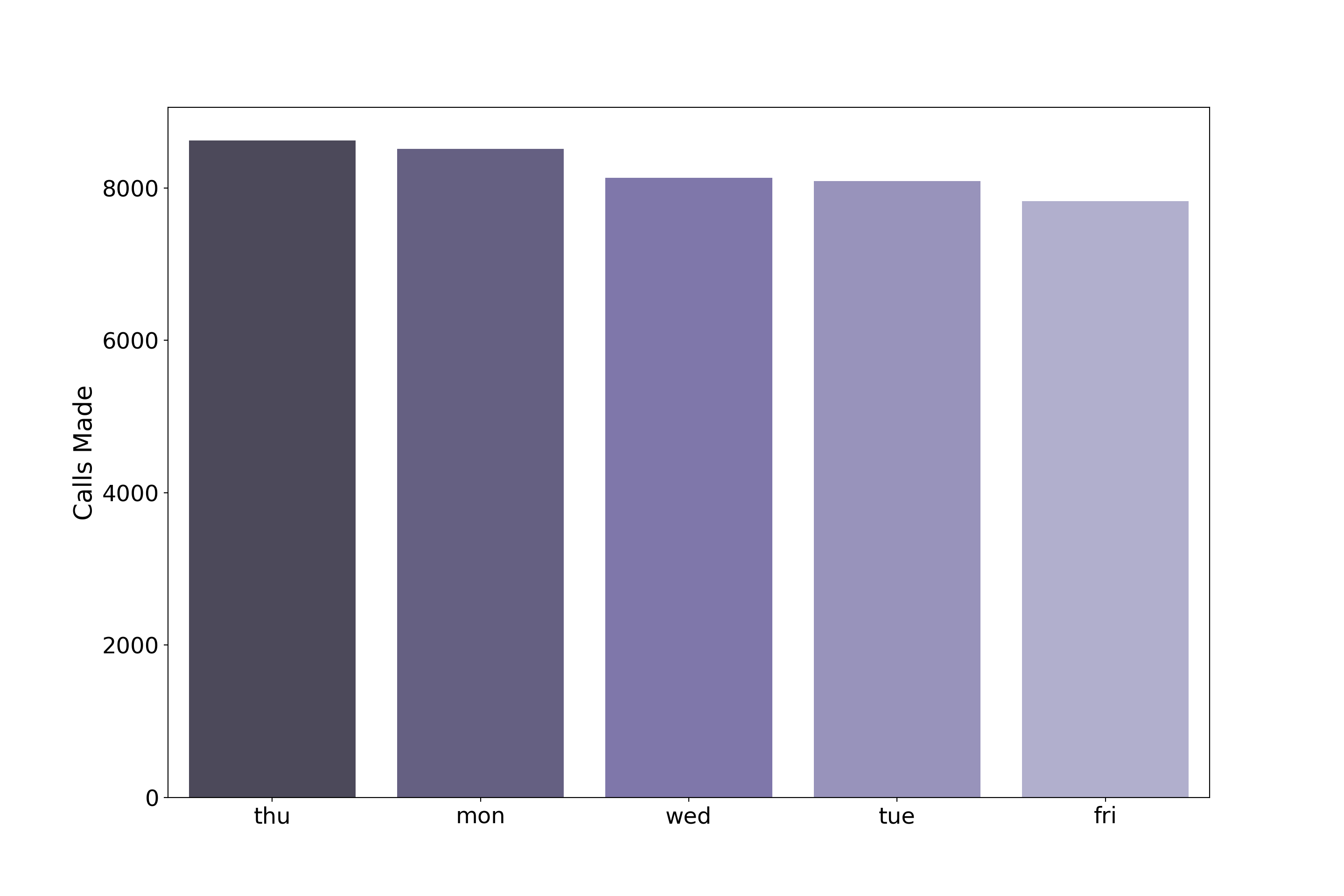
In terms of follow-up call days, bankers show some preference, most following up on Thursday and least on Fridays, but these differences don’t seem significant.
Time elapsed since a prospect was previously called
# plotting how long it took for a prospect to receive
# another campaign call

# remove people who were contacted for the first time
bank_pdays_filtered = bankingDF[bankingDF["pdays"] != 999]
# plot data this way to change x-axis label from default
ax = sns.violinplot(x="pdays",
                   data = bank_pdays_filtered,
                   color="turquoise")
#_=ax.set(xlabel = "Days since last contact")
ax.grid(False)
plt.tick_params(labelsize = 18)
_=plt.xlabel("Days since last contact", fontsize=19)
plt.show()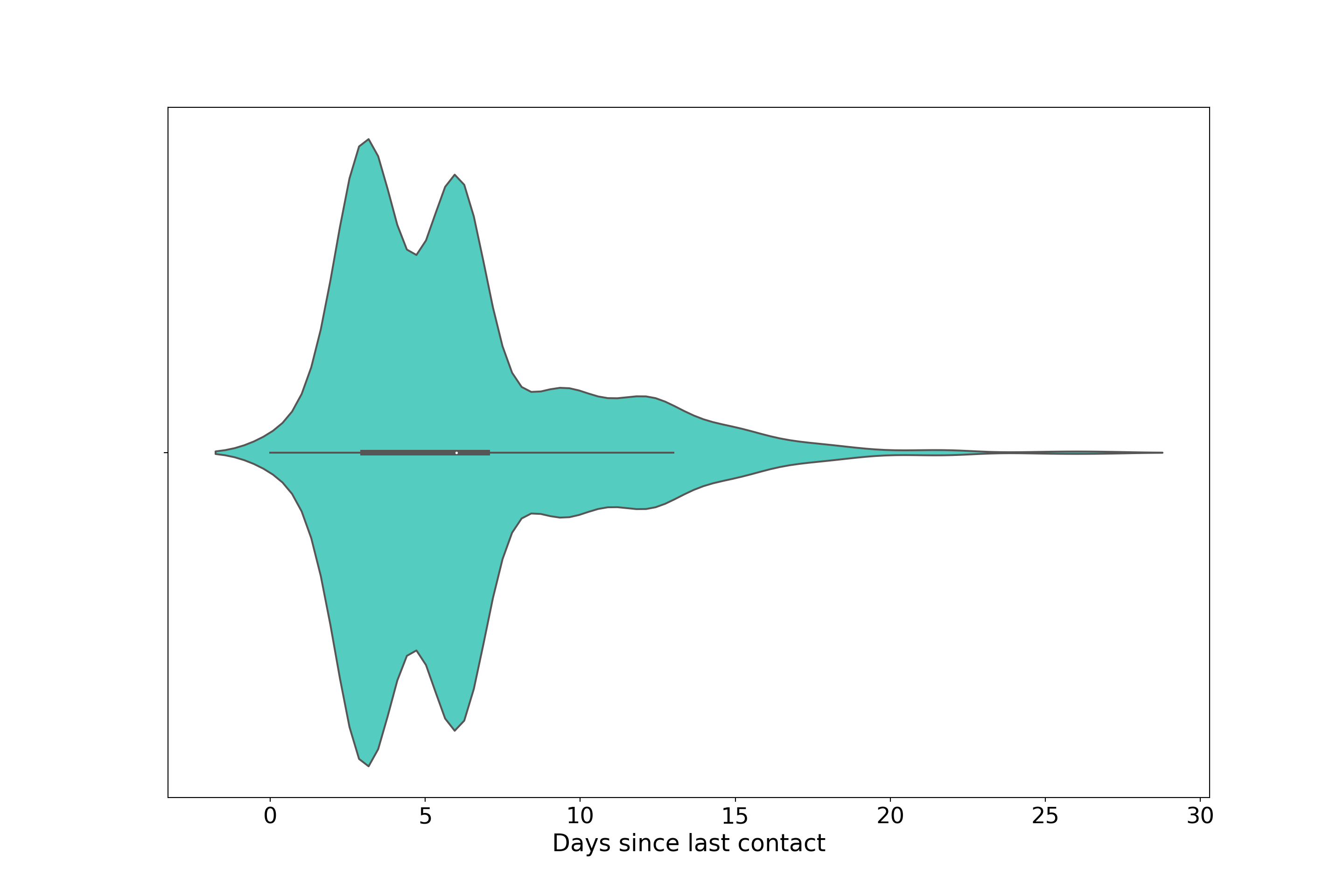
We see evidence of bimodality and right-skew from this violinplot, aspects not clearly seen in the inscribed boxplot.
Bankers followed up with them roughly between 3 and 6 days after their latest call for most people in this data. The two peaks are perhaps indicative of early stage sale-pitching by the banks where communication is frequent. For those in late-stage or completed negotiations, or people who constantly ignore campaign calls, the right skew probably reflects such cases.
Education level of prospects
fig, ax = plt.subplots(figsize=(10,6))
education_totals = bankingDF["education"].value_counts()
education_totals = pd.DataFrame({"Education Type": education_totals.index,
                         "Total": education_totals.values})

my_range=range(1,len(education_totals.index)+1)
_=plt.hlines(y=my_range, xmin=0, xmax=education_totals['Total'], color='skyblue')
_=plt.plot(education_totals['Total'], my_range, "o")

_=plt.yticks(my_range, education_totals['Education Type'])
_=plt.grid(False)
_=plt.tick_params(labelsize="small")
_=plt.show()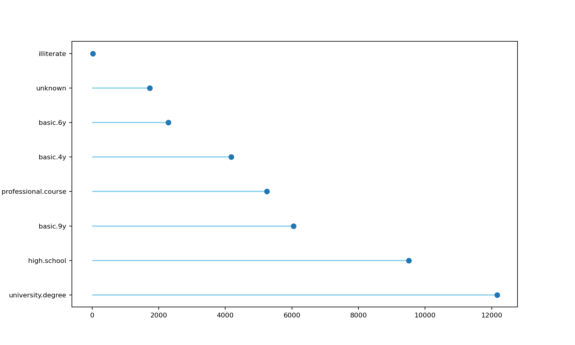
Code for lollipop chart adapted from here. As you’d expect the bank tends to target those who have, at the very least, completed high school. Greatest preference is shown towards college educated individuals. Again, this makes sense since they tend to earn more money relative to other education groups, making them likelier to deposit money.
Explore Joint Attributes
Job and Education
_=plt.subplots(figsize=(10,8))
_=sns.heatmap(pd.crosstab(bankingDF["education"],bankingDF["job"]),
            annot=True, fmt="g")
plt.tick_params(rotation=45, labelsize=7)
_=plt.ylabel("Education")
_=plt.xlabel("Job")
plt.show()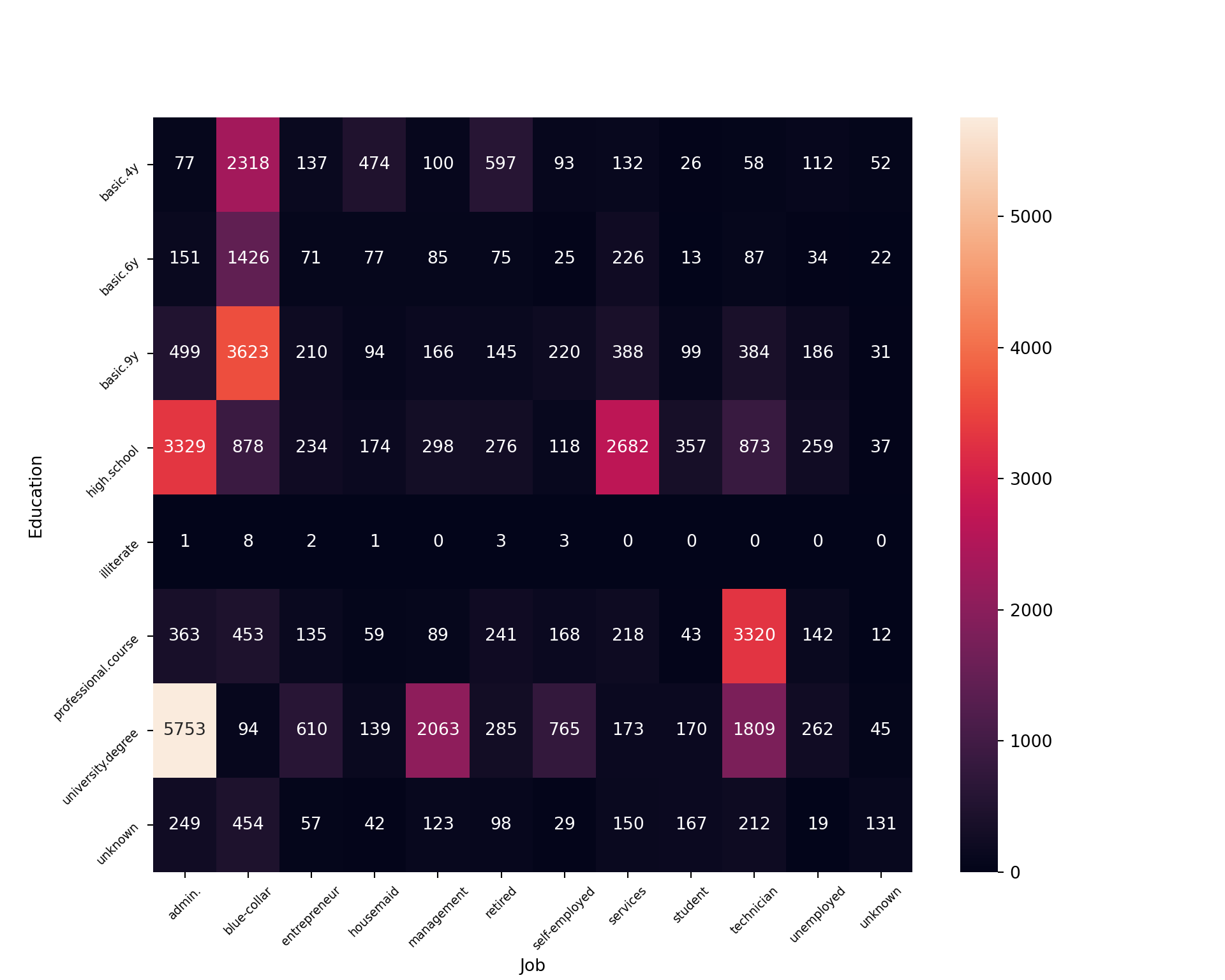
We can visualize a cross tabulation between education level and job status. There isn’t much to be said for illiterate folks, but for those with unknown education tend to work blue-collar, admin, and technician type jobs. The most blue collar employees are those with basic.4y, basic.6y, and basic.9y educations. It’s not clear what these categories represent. College educated individuals work predominantly as admins, in management, or as technicians. High school grads also work in large proportion within admin, but also in the services industry.
Consumer Confidence and Consumer Price Indexes
ax = sns.lmplot( x="cons.price.idx", y="cons.conf.idx",
               data=bankingDF, fit_reg=True, line_kws={'color': 'red'})
plt.grid(False)
_=plt.xlabel("Price Index")
_=plt.ylabel("Confidence Index")
plt.rcParams.update({'font.size': 12})
plt.show()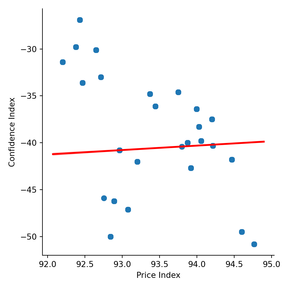
Almost no correlation is present between consumer confidence and the price index. That being said, the price index is relatively consistent in this data, ranging from ~ 92 to ~ 95, so it’s unsurprising to see a flat relationship between these variables (the correlation is ~ 0.06). Consumer confidence was negative in Portugal throughout 2014 (when this data was taken) and has been that way for nearly the past decade, as can be seen here. As an aside, that the correlation between price index and consumer confidence is slightly positive is mildly interesting.
Month and Day of Week of Contact
pd.crosstab(bankingDF["day_of_week"],bankingDF["month"])month apr aug dec jul jun mar may nov oct sep
day_of_week
fri 610 1070 24 1012 1147 94 2858 755 142 115
mon 702 1222 53 1516 1251 143 2642 766 129 90
thu 768 1347 45 1672 967 99 2537 903 163 122
tue 252 1296 25 1517 970 140 2809 814 149 118
wed 300 1243 35 1457 983 70 2923 863 135 125fig, ax = plt.subplots(figsize=(15,10))
day_and_month = pd.crosstab(bankingDF["day_of_week"],bankingDF["month"])
day_and_month = day_and_month.reindex(['mar', 'apr', 'may', 'jun', 'jul', 'aug', 'sep','oct', 'nov', 'dec'], axis=1).reindex(["mon","tue","wed","thu","fri"])
_=sns.heatmap(day_and_month, annot=True, fmt="d", cmap="YlGnBu", ax=ax,annot_kws={"size":16})
_=plt.xlabel("")
_=plt.ylabel("")
_=plt.tick_params(labelsize=15)
plt.show()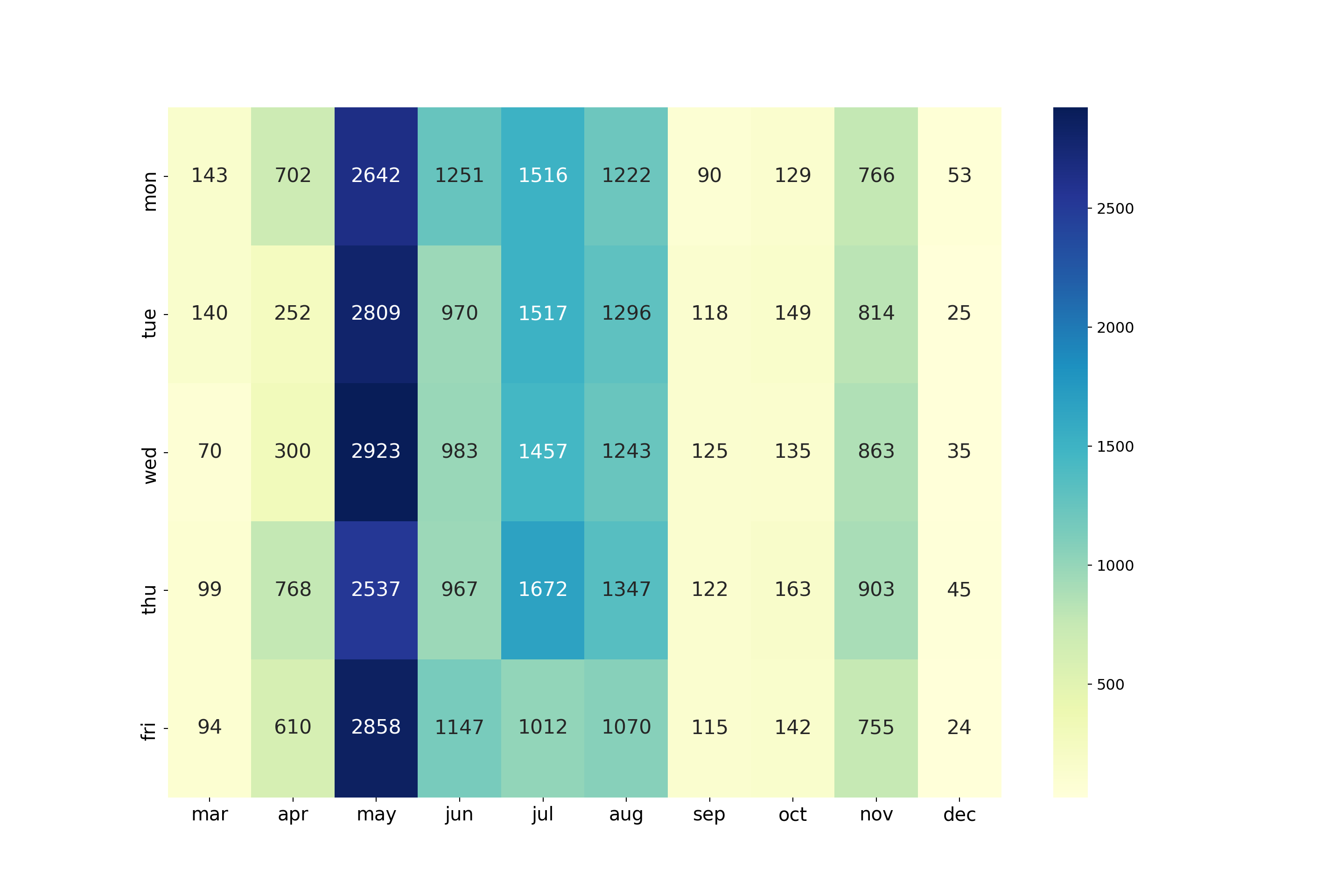
The most popular months for calling are the late spring and summer months: May through August. The least popular months were in the fall and winter (September, October, and December), although November marks an uptick in campaign calling. There is no data for January or February, implying the latest campaign began in March.
Timing of return call depending on previous campaign outcome
# filter out the first-time calls
outcome = bankingDF.loc[bankingDF["poutcome"].isin(["failure", "success"])]
# find mean time elpased from previous campaign call
outcome_tab = outcome[outcome["pdays"] != 999].groupby("poutcome").agg({"pdays":"mean"})
outcome_tab.index.names = ["Prev. Call Outcome"]
outcome_tab.rename(columns = {"pdays": "Avg. Days Until Next Call"})
Avg. Days Until Next Call
Prev. Call Outcome
failure 10.140845
success 5.587764On average, if a previous campaign call failed, the bank would wait about twice as long to recall the prospect compared to recall time for previous campaign calls that succeeded.
Explore Attributes and Prediction Class
As is often the case, this class is imbalanced. People tend to reject the bank’s offers, so oversampling those who didn’t reject (those who do subscribe to a term deposit) is needed in the future.
Education and Subscribers
# all those who subscribed, grouped by education
accepted = bankingDF[bankingDF["y"] == "yes"].groupby("education").agg({"y":"count"}).reset_index()
accepted = accepted.sort_values('y')

# lollipop plot
my_range=range(1,len(accepted.index)+1)
sns.set_style('dark')
fig, ax = plt.subplots(figsize=(8,6))
_=plt.hlines(y=my_range, xmin=0, xmax=accepted['y'], color='maroon')
_=plt.plot(accepted['y'], my_range, "o", color = 'maroon')
_=plt.yticks(my_range, accepted['education'], rotation=45)
_=plt.xlabel('Contacts who accepted bank offer')
_=plt.tick_params(labelsize=10)
_=plt.ylabel('Education Level')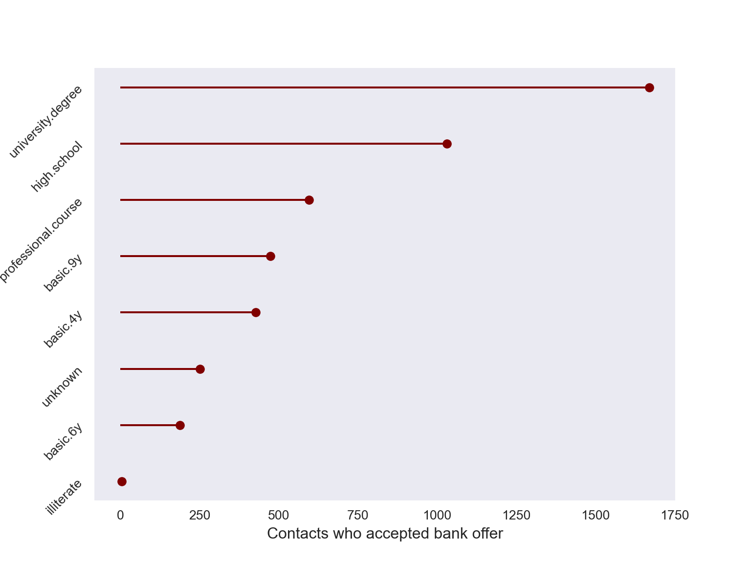
The majority who sign up with the bank are college educated, but the pattern above is almost identical for those who reject the bank. This suggests the need to examine prevalence rates across education levels, as will be seen later.
Call Duration and Outcome (Non First time calls)
The vast majority of bank calls are to first time contacts, so we’ll like to see the call distributions for non-first timers.
first_timers = len(bankingDF[bankingDF["pdays"] == 999]) / bankingDF.shape[0]
print("Proportion of first time calls: ", round(first_timers, 3))
Proportion of first time calls: 0.963success = bankingDF[(bankingDF['y'] == "yes") & (bankingDF['pdays']!=999)]
fail = bankingDF[(bankingDF['y'] == "no") & (bankingDF['pdays']!=999)]
fig, ax = plt.subplots(figsize = (12,8))
for a in [success, fail]:
_=sns.distplot(a["duration"], bins=range(1, 3600, 20), ax=ax, kde=False)
_=ax.set_xlim([0, 4000])
_=fig.legend(labels = ["Subscribed","Rejected"], fontsize=12)
_=plt.xlabel("Duration of Last Phone Call (Seconds)", fontsize=14)
_=plt.grid(False)
_=plt.tick_params(labelsize=13)
_=plt.show()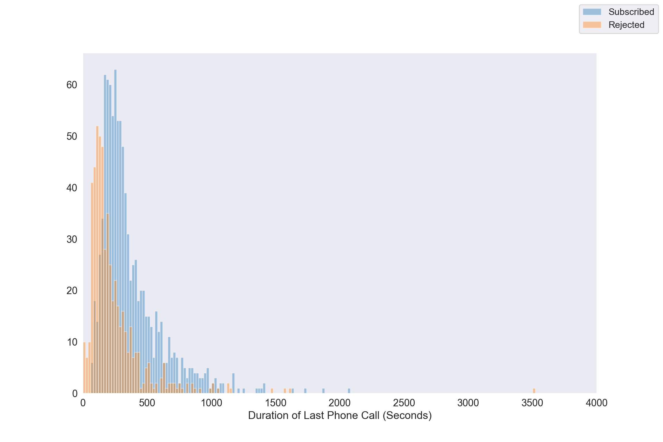
As is pointed out call duration isn’t known before the bank makes a call, and the outcome of the call is known immediately after a call. So duration can’t be used as a predictor when building a model. Nevertheless, for those who’ve been contacted before, bank-rejecters spend on average less time engaging with the bank agent. The distribution of talk time is right-skewed regardless of call outcome. When analyzing the response and duration it needs to be done in a retrospective manner.
Day of Week and Subscriptions
fig, ax = plt.subplots(figsize=(5,5))
_=sns.heatmap(pd.crosstab(bankingDF["day_of_week"],bankingDF[bankingDF['y'] == "yes"]["y"]).reindex(["mon","tue","wed","thu","fri"]),
            annot=True,ax=ax, fmt="g")

_=ax.set_xlabel("")
_=ax.set_ylabel("")
plt.rcParams.update({'font.size': 18})
plt.show()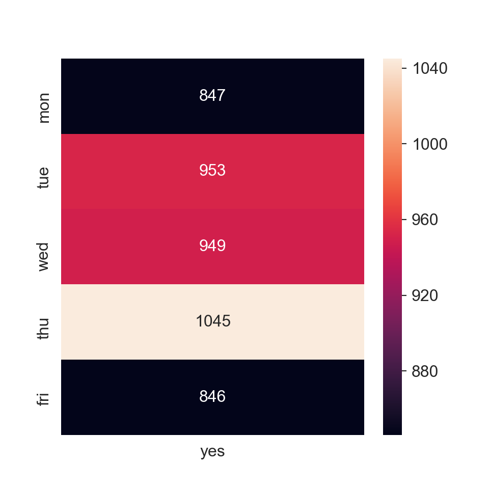
The most successes come on Thursdays, followed by a near tie between Tuesday and Wednesday. It seems like the beginning and end of the week are the least favorable days to call.
Job Profession of those who Subscribe
fig, ax = plt.subplots(figsize=(10,6))
# all those who subscribed, grouped by education
accepted = bankingDF[bankingDF["y"] == "yes"].groupby("job").agg({"y":"count"}).reset_index()
accepted = accepted.sort_values('y')

# lollipop plot
my_range=range(1,len(accepted.index)+1)
sns.set_style('dark')
_=plt.hlines(y=my_range, xmin=0, xmax=accepted['y'])
_=plt.plot(accepted['y'], my_range, "o", color="black")
_=plt.yticks(my_range, accepted['job'])
_=plt.tick_params(axis="y", labelsize=8, rotation=30)
_=plt.tick_params(axis="x", labelsize=11)
_=plt.xlabel('Contacts who accepted bank offer', fontsize=12)
_=plt.ylabel('Job Type', fontsize=12)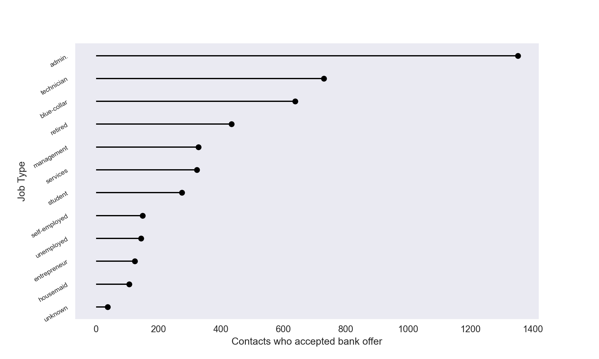
Interestingly, retired folks were one of the least targeted groups (look back at the age histogram) that ended up subscribing quite often.
Prevalance Rates by Job Category
The plot immediately above gives the raw values of subscribers by job type. We also know the overall prevalence rate is ~ 11%. Perhaps there’s quite a bit of imbalance between education or job positions so we’ll see if prevalence rates differ by category.
_=plt.subplots(figsize=(8,6))
# those who accept by job category
job_yes = (bankingDF[bankingDF["y"] == "yes"]
    .groupby('job')
    .agg({'y':'count'})
    .rename(columns = {'y':'Subscribed'})
    .reset_index())

# total number of people in each job category
# regardless of subscription status
all_job = (bankingDF
    .groupby('job')
    .agg({'y':'count'})
    .rename(columns = {'y':'Job Total'})
    .reset_index())

# calculate prevalence rates
job_yes['Job Total'] = all_job["Job Total"]
job_yes["Prevalence Rate"] = job_yes["Subscribed"]/job_yes["Job Total"]
job_yes = job_yes.sort_values("Prevalence Rate", ascending=False)


_= sns.barplot(job_yes["job"], job_yes["Prevalence Rate"],
           palette=sns.cubehelix_palette(12, reverse=True),
          )

_=plt.xlabel("")
_=plt.tick_params(axis="x", labelsize=8, rotation=30)
_=plt.tick_params(axis="y", labelsize = 11)
_=plt.ylabel("Prevalence Rate", fontsize = 12)
plt.show()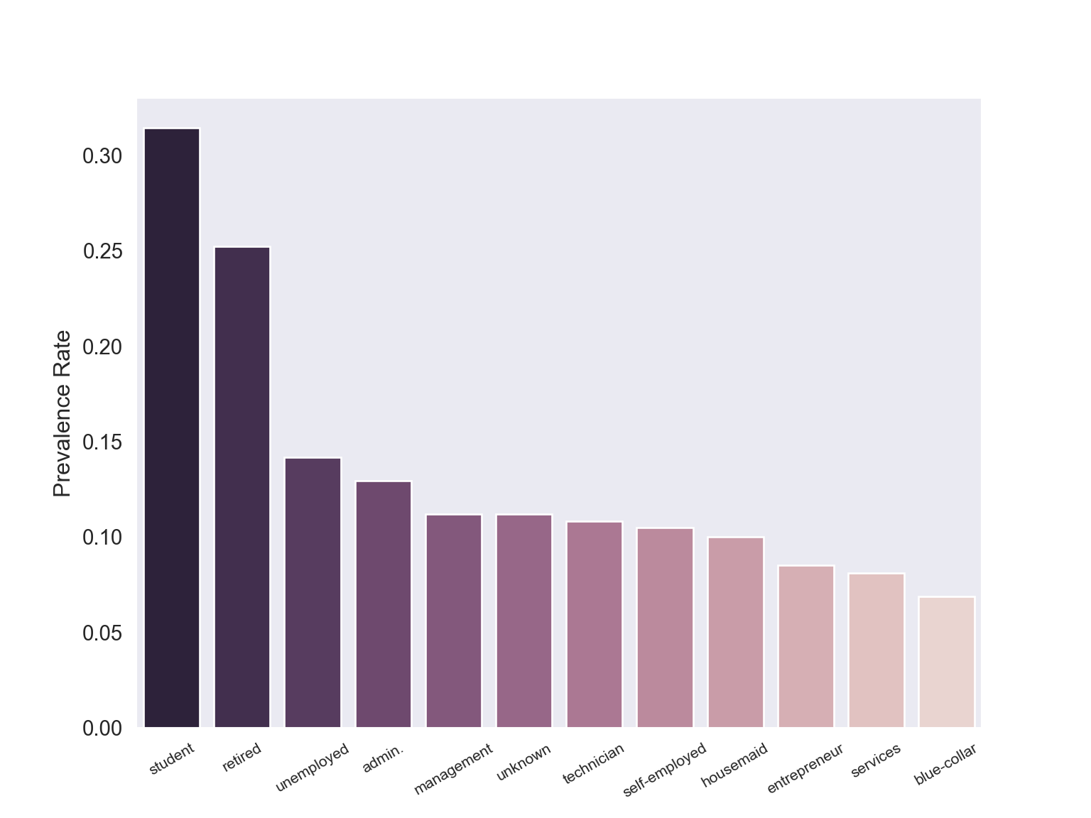
job_yes.set_index("job") Subscribed Job Total Prevalence Rate
job
student 275 875 0.314286
retired 434 1720 0.252326
unemployed 144 1014 0.142012
admin. 1352 10422 0.129726
management 328 2924 0.112175
unknown 37 330 0.112121
technician 730 6743 0.108260
self-employed 149 1421 0.104856
housemaid 106 1060 0.100000
entrepreneur 124 1456 0.085165
services 323 3969 0.081381
blue-collar 638 9254 0.068943Perhaps surprisingly, students have the highest prevalence (~31.4%) albeit being one of the least targeted demographics. By contrast blue-collar prospects were second most called (see “Education Levels” section) yet had the lowest conversion rate at ~ 6.9%. This plot confirms raw values give an incomplete picture of conversion. We can summarize the first fact with this simple text graphic below.
fig, ax = plt.subplots(figsize=(6,6))
_=plt.text(0.29, 0.6, "31%", size=40,
         va="baseline", ha="right", multialignment="left",
         color = "green"
        )

_=plt.text(0.8, 0.6, "of students converted...", size=16,
         va="baseline", ha="right", multialignment="left"
         )

_=plt.text(0.15, 0.4, "...yet made up only", size=16,
         va="baseline", ha="left", multialignment="left"
         )

_=plt.text(0.57, 0.4, "2%", size=20,
         va="baseline", ha="left", multialignment="left",
         color="red"
         )

_=plt.text(0.67, 0.4, "of contacts", size=16,
         va="baseline", ha="left", multialignment="left"
         )

plt.gca().axes.get_yaxis().set_visible(False)
plt.gca().axes.get_xaxis().set_visible(False)
plt.show()
The bank should consider reaching out to students more often.
Prevalence Rates by Education Level
We now do the same analysis for education.
educ_yes = (bankingDF[bankingDF["y"] == "yes"]
    .groupby('education')
    .agg({'y':'count'})
    .rename(columns = {'y':'Subscribed'})
    .reset_index())

# total number of people in each job category
# regardless of subscription status
all_educ = (bankingDF
    .groupby('education')
    .agg({'y':'count'})
    .rename(columns = {'y':'Education Total'})
    .reset_index())

# calculate prevalence rates
educ_yes['Education Total'] = all_educ["Education Total"]
educ_yes["Prevalence Rate"] = educ_yes["Subscribed"]/educ_yes["Education Total"]
educ_yes = educ_yes.sort_values("Prevalence Rate", ascending=False)


_=sns.barplot(educ_yes["education"], educ_yes["Prevalence Rate"],
           color="skyblue")

_=plt.tick_params(axis="x", labelsize=8, rotation=30)
_=plt.tick_params(axis="y", labelsize = 11)
_=plt.ylabel("Prevalence Rate", fontsize = 12)
plt.show()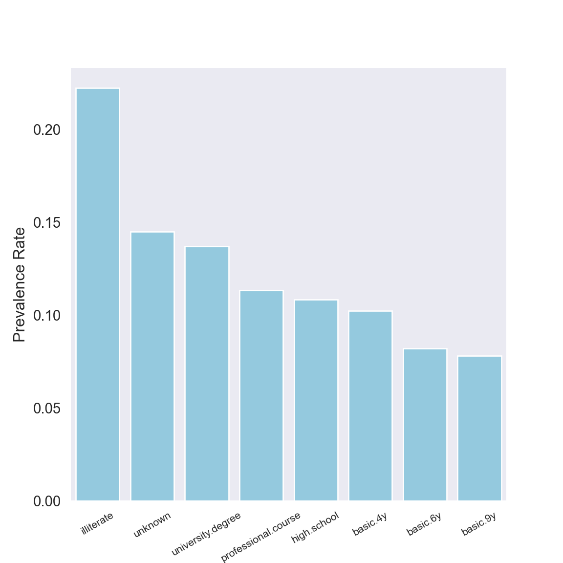
educ_yes.set_index("education") Subscribed Education Total Prevalence Rate
education
illiterate 4 18 0.222222
unknown 251 1731 0.145003
university.degree 1670 12168 0.137245
professional.course 595 5243 0.113485
high.school 1031 9515 0.108355
basic.4y 428 4176 0.102490
basic.6y 188 2292 0.082024
basic.9y 473 6045 0.078246With only 18 illiterate contacts it’s no surprise seeing an inflated prevalence rate for that group. Just like job category, we see an asymmetry in education level: those with an unknown education fall nearly last in terms of being contacted (see “Education level of prospects” section) but converted second most often (or the most often if you ignore contacts who were illiterate).
Extra features
Here are some other variables that could widen the scope of analysis:
- (Monthly) Income: this adds more info than
loanordefault - Current bank provider: if someone has a different bank than this Portugal bank, they may be less likely to accept
- Does the prospect have kids?
- If so, what is the current education level or age of the kid(s)?
- Is the bank agent who called male or female?
- Is the prospect male or female?
A (major) caveat is some of this info may be thought too personal to share.
Extras
Rejecting the bank: what are the odds?
For individuals with similar age, education, job, and marital status, what are the odds someone with a personal loan rejecting the bank’s offer compared to that of someone without a personal loan rejecting the bank’s offer? We’ll look at single college graduates in the age range 30-40 who work in administrative positions. These characteristics comprise one of the largest demographics targed by the bank.
# getting the desired sample (retrospectively)
bank_retro = bankingDF[(bankingDF["age"].between(30,40)) &
          (bankingDF["education"] == "university.degree") &
          (bankingDF["job"]=="admin.") &
          (bankingDF["marital"] == "single") &
          (bankingDF["loan"] != "unknown")]

# two way table summary
retro_tab = pd.crosstab(bank_retro["loan"], bank_retro["y"], margins=True, margins_name = "Total")
retro_tab.columns.names = ["Subscribed?"]
retro_tab.index.names = ["Personal Loan?"]
retro_tab
Subscribed? no yes Total
Personal Loan?
no 976 154 1130
yes 226 23 249
Total 1202 177 1379From this we see, for instance, 226 people who rejected the bank (i.e. did not subscribe) had a personal loan. We can compute the odds ratio (the odds of rejecting) as follows:
- Odds of saying no, given that one has a personal loan: \(\frac{226}{23}\)
- Odds of saying no, given that one doesn’t have a personal loan: \(\frac{976}{154}\)
Therefore the odds of rejecting the bank’s offer if one has a personal loan is (226/23)/(976/154) = 1.55 times higher than the odds of rejecting the bank if one has no personal loan. This applies only to those with the prescribed characterisitcs above: between 30-40 years old, college grad, single, and working in admin.
Equivalently, the odds of someone with a personal loan rejecting the bank is 55% higher than the odds of someone without a personal loan rejecting the bank. This (again) applies only to those with the prescribed characterisitcs just mentioned.
If the banking agency chose its contacts based off of random sampling, then these inferences are applicable to those in the general public in the same demographic. Said differently, the scope of inference wouldn’t be restricted to just those in the current dataset. We’ll assume for simplicity that random sampling was used.
The upshot would then be this: the bank runs a higher risk of rejection if people in the aforementioned demographics have personal loans, which is pretty intuitive - people in debt are less likely to fork out money.